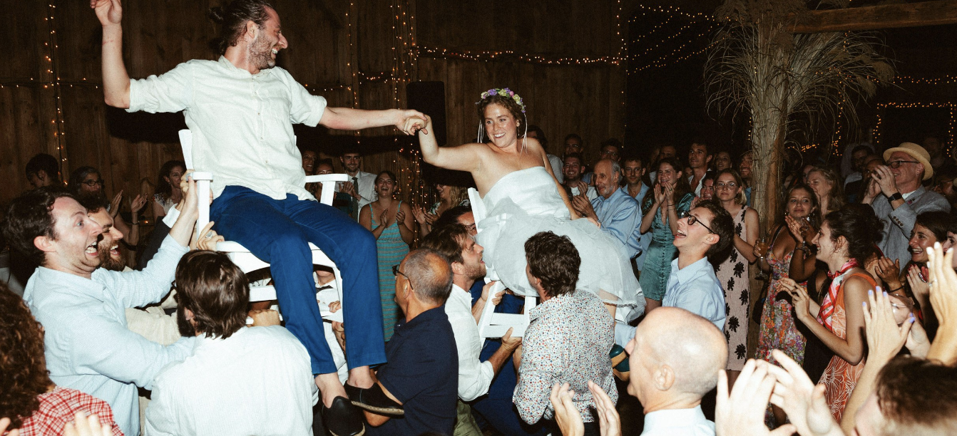
PROJECT O1When Grace of Good Graces Events came to us, she had already built a reputation for pulling off high-style, low-stress gatherings—the kind where hosts actually enjoy their party, and guests remember every effortless detail. As her business grew into a sought-after name for weddings, parties, and retreats across New England and the Hudson Valley, it was time for a brand that could keep pace.
We gave Good Graces a signature May Assembly glow-up—crafting a spirited, hand-drawn logo that feels personal and playful, plus an iconic “Grace Girl” illustration who curtsies with charm and nods to Good Graces’ service-first ethos. The color palette—bold red ribbon, candlelight yellow, and a dash of dirty martini green—feels festive yet grounded, reflecting the brand’s New England roots with a modern twist.
With this fresh brand in hand, Good Graces is set to keep bringing the vibes, happy tears, and impeccable taste to every celebration. We’re raising a glass (martini, extra dirty) to all that’s ahead.
Brand Identity
Brand Illustration
Brand Copy
GOOd GraCes


